No Worries: Design Publishing in Australia.
No Worries: Design Publishing in Australia.
Essay published in Desktop Magazine's 30th Anniversary (& last ever) issue
How have magazines and journals shaped Australian design culture? It’s an awkward question in an issue celebrating 30 years of what has been the nation’s only regular magazine about graphic design.
There is much to celebrate about Australian graphic design, and like anywhere else, there is also plenty to criticise. You’ll need a machete however to hack through the dense jungle of flattery to chance upon a rare flower of criticism. Australian industry-focused graphic design publishing (both print and digital) has been automatically laudatory, presenting content context free and unburdened by critical perspectives. And on the other hand, our academic journals are often guilty of the same crimes in inverse – failing to acknowledge a potential audience in ordinary practitioners, burying genuinely important and useful ideas in unnecessarily alienating prose. Has all this stunted the maturity of the national design culture? Has it resulted in a kind of developmentally delayed discipline unable to fulfil its potential, and adequately respond to the serious challenges of economy, society and environment? Why don’t we think and write about design as if people mattered, and as if design mattered to people?
Desktop, as the quaint nostalgia of its moniker suggests, began like most trade mags by offering industry news and practical information about technology and technique – a valid enough mission in pre-internet Australia. There were similarities with U.S. magazines like HOW and Communication Arts, and in the U.K., Computer Arts and Design Week. But in Australia, there was also a lack of alternatives – no Emigre, Eye, or even Creative Review or Print magazines (let alone ventures like Stuart Bailey and Peter Bilak ‘s Dot Dot Dot, or Jonty Valentine and Luke Wood’s NZ magazine, The National Grid). There were few, if any, popular options offering reflective, creative consideration of the deeper themes effecting a rapidly changing discipline.
Several independent, illustration-focused, gallery style magazines such as Deanne Cheuk’s Neomu and Andrew Johnstone’s Empty, as their titles hinted, only ever aimed at surfaces. (In Chinese Chan and Japanese Zen traditions, ‘Mu’ literally means ‘nothingness’ – but more a ‘no-thingness’ that rejects dualistic understanding, and not so much the nothingness of absent contextual and critical content.)
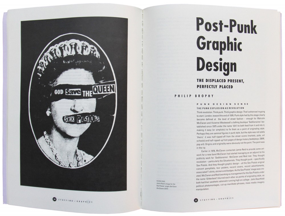
 Stuffing. Art:Graphics 1990. Magazine edited by Philip Brophy and Ian Robertson in Melbourne, Victoria.
There have been local occasional publications with more ambition such as Philip Brophy’s remarkable late 80s Stuffing, Stuffed, and Restuff zines, Stephen Banham’s compact but adventurous Qwerty and Ampersand booklets, and Kevin Finn’s bulky but diffused Open Manifesto, along with other significant independent experiments that come and go.
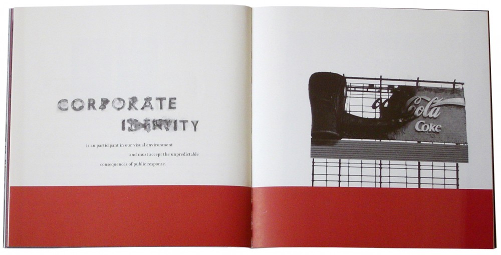
 Ampersand 1996. Booklet by Stephen Banham (Letterbox) in Melbourne, Victoria.
A visit to Australia’s online ‘design communities’ such as designiskinky.net or australianinfront.com.au will soak you to the skin in fashionable, illustrative design and superlative adjectives – everything is ‘awesome’, ‘amazing’, ‘cool’ and ‘nice’. This oppressively obsequious culture of compliant friendliness will greet you with a bouquet and a pat on the back wherever you turn. The relentless positivity and perpetual suspension of critique does no one any favours. Imagine responding to other creative forms in the same way. To every film five stars! To every novel a Pulitzer Prize! To every concert a standing ovation! This flattened landscape of cultural indiscrimination just breeds mediocrity. And more importantly, like a child that’s never been told ‘no’, it actually encourages damaging behaviours. Here we see: the distorted emphasis of visual communication as wholly market driven; the parochial stalemates of insularity; the fixed focus on aesthetic trends; the empty clanging of celebrity echo chambers; the futile and embarrassing hunt for perceived cool; the unquestioning embrace of marketed technology – to name but a few.
Of course these aren’t problems unique to design publishing. As journalism in all fields comes under mounting economic pressure, our daily news, for example, is increasingly becoming PR spin. Back in 2010, a major investigation by Crikey and the University of Technology Sydney found that between 42% and 70% of all newspaper stories in the Australian media were public relations driven, with reporting based on press releases and the like. But at least that leaves a minority of content untainted by an external marketing agenda, a feat seemingly beyond many Australian design publications.
In recent years, a succession of Desktop editors have evolved the magazine by tackling a more ambitious range of themes, in more depth, and with more diverse writers. After all, how seriously could readers take a magazine that has betrayed a lack of critical investment in the work it presented? This isn’t just about a publisher’s imperative to be cordial – a continuing reluctance to move beyond hagiography and call out spin. It’s even in very telling details like the periodic absence of page numbers and image captions. If a publication like Desktop didn’t care sometimes to number its pages, there is little expectation anyone would cite any of its content: “Check out the great story on page, um… about half way through.” And if it didn’t care to even label the presented work with captions (or more recently, apply captions that often don’t actually tell us much more than the picture itself does), why would an audience care about context? If the images of work are presented to be skimmed as eye-candy, deflecting critical insight like sunbeams off polished surfaces, why would we care about investing in informed understanding?
And if we don’t understand our work, other’s work, our industry, how can we escape the thwarted agency of instrumental constraints? Why would we even try?
Some of the justifications I’ve heard for a uniquely antipodean design-publishing malady apply apocryphal and contradictory ideas about the national character. We’re egalitarian – everyone’s equal, so criticism is gratuitous. Yet, we’ll cut you down if you’re a tall poppy – don’t get up yourself expressing intellectual ambition. We’re mates, we’re not going to write anything critical about our peers or colleagues. We’re larrikins – we’ll not take our discipline too seriously. Other, more likely explanations include the relative youth of the culture, the poor state of formal design education, and the industry’s complicity in the calculated lies of consumer capitalism. Whatever the authentic historical reasons, can we agree that she’ll be right is wearing thin?
In the other camp too, songs are sung to the choir. Academic writing necessarily employs specialised language to articulate complex or esoteric ideas. However, far too often, thin ideas are draped in clumsy theoretical clichés and contorted prose. The vital content of our universities’ peer-reviewed research papers could both be more accessible on their own terms, as well as being interpreted, if necessary, for the wider design community (and beyond) in a broader variety of publications.
It’s certainly possible to present design theory in an engaging way. Academic journals such as MIT’s Design Issues have been doing it for nearly thirty years.
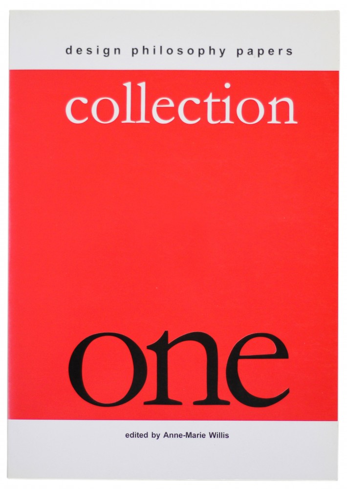
 Design Philosophy Papers, Collection One 2004. Journal published by Tony Fry and Ann-Marie Willis (as Team D/E/S) from a farm near Toowoomba, Queensland.
In Australia, Design Philosophy Papers is an independent journal founded by Tony Fry & Anne-Marie Willis that has made a significant contribution promoting “reflective thinking on design from cognate areas such as cultural theory, anthropology, sociology, ethical theory, philosophy of technology and philosophy”. It aims to enhance the level of international debate about design and increase the understanding of its significance in the wider intellectual community as well as by designers themselves. Even here though, its contributors often don’t achieve the persuasive clarity of Willis’s editorial introductions. There’s a disjuncture between the stated urgency of its mission to address design’s role in what Fry terms ‘defuturing’, and a deferring of the responsibility to more broadly disseminate important ideas. Too often potent ideas are subverted by backbreaking prose.
The charges that industry magazines are superficial and that academic journals could be more inclusive aren’t exactly new. And sure, these complaints can be as lazy as their intended targets’ crimes – ultimately, there are plenty of brilliant exceptions. But for every article I’ve admired, there are myriad that have incited violent motivations. My question is: can the two camps be synthesised? Can we transcend the rigid binary that segregates academic and industry territories? I definitely don’t mean, as the conservatives are now demanding of the CSIRO and Australian science research generally, that it instrumentally serve the interests of the market over the established priorities of the common good. Is there an Australian publisher out there that can do for graphic design what has been done for the best popular art, architecture, literary, and even philosophy and science journals? If the abstrusities of science, for example, can speak to general readers so engagingly in mags like NewScientist, why not graphic design? Seek out the most exciting research and write about it in magazines like Desktop as if it were actually exciting.
This means acknowledging that inevitably, sometimes, an academic’s strength might not be as a writer. And that similarly, sometimes, a practitioner’s work and insights might not be worthy of an elevated public platform. Or that when they are deserving, there be a less compliant, more convincing case made for why – that less vapid, more constructive and critically aware standards prevail. And of course most Australian design academics are also practitioners, so isn’t this an all round, over-ripe, opportunity for a revived public discourse about our visual culture?
There are now no Australian graphic design magazines on the national newsstands. For Australian design publications to survive and thrive, they will need to be relevant. There are now so many sources for the conservative, standard fare, and still so few accessibly rigorous, adventurous alternative voices. The maxim that designers don’t read, is at once a cop-out and a truism – after all, given what’s on offer, why would we?
+
Jason Grant 2016