Cultured Graphic Hygiene
Cultured Graphic Hygiene
Essay published on Design Observer (and be sure to check out the comments section)
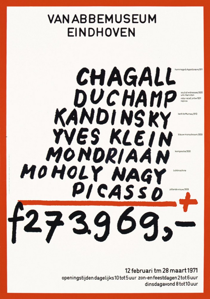
The poster below, by Jan van Toorn for the Van Abbemuseum, is a museum exhibition promotion but it is also a bold critique. It manages to disclose the banalities of both the art market and of accepted visual communication processes. The work represents Van Toorn’s career-long concern with reclaiming the media as a channel of communication, from its modern role of mere distribution, or worse, of obfuscation and deception.
 Jan van Toorn, Van Abbemuseum, 1971
Regardless of how difficult, disobedient or messy a subject, most museum posters are courteous and clean, and nothing if not formulaic. A tasteful crop of a key image with sympathetic, unobtrusive typography. Or if the institution’s branding is involved, possibly a little less sympathetic and a little more obtrusive. Is there any reason why graphic design for museums and galleries shouldn’t be the measure of their exhibits? Can’t a poster, in its own way, be as good as what it’s promoting? Not the direct equivalent of a Picasso exactly, but at least as ambitious within its own field? And how hard can it be to outshine a lot of contemporary art?
Jan van Toorn’s poster presents a shopping list of artist’s names: Chagall, Duchamp, Kandinsky, Klein, Mondrian, Moholy Nagy and Picasso, ending with the tallied cost of the museum’s acquisitions, 273,969 guilders. The text, both typeset and handwritten, is in black and the entire composition is framed by a thick red border. Hanging under the horizontal red rule, the tallied cost is the largest single element, with the artists’ names stacked above it. The museum’s name is centered at the top as if heading official stationery on which the list has been scrawled.
I tried hard to imagine any of the galleries I regularly visit creating something similar. I failed.
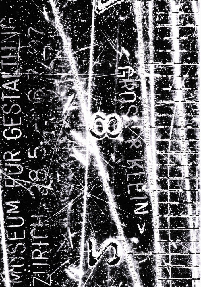 Ralph Schraivogel, Gross und Klein, 1997
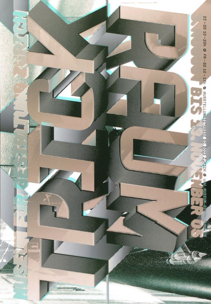 Martin Woodtli, Trickraum, 2005
Sure, sometimes a potent, representative image unmolested by intrusive type will do the trick - not so much as a gesture of polite visual etiquette as a statement of considered graphic impact. But usually it just looks lazy. This is generally the case for even the world’s greatest galleries and museums. Predictable, safe and forgettable, breeding a kind of cultured visual hygiene.
Of course, Van Toorn is exceptional in a country of exceptional graphic design. The Netherlands famously produces some of the most adventurous visual communication promoting culture. And there are many other striking exceptions around the world. I’ve long appreciated the Museum fur Gestaltung Zurich commissioning the likes of Ralph Schraivogel, Martin Woodtli and Cornel Windlin. Likewise, James Goggin’s subtle posters for the Tate transcend brand bullying.
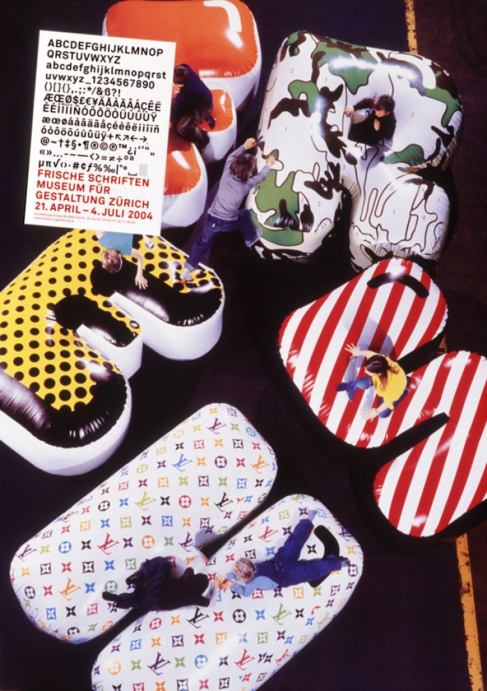 Cornel Windlin, Frische Schriften, 2004
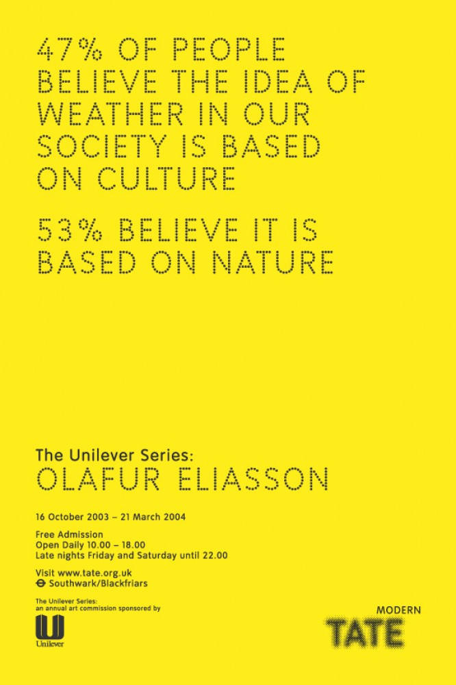 James Goggin, Olafur Eliasson, The Weather Project, 2003
The success of Van Toorn’s poster is not just its memorable impact but also its reconciliation of the designer’s agenda and the client’s needs. The poster functions as a provocative promotion and a considered expression of the museum’s identity, suggesting institutional transparency and public accountability.
This is characteristic of Van Toorn’s work from the 1970’s onwards, rejecting modernism’s pretense of objectivity to reveal intrinsically manipulative visual codes and embedded points of view. Van Toorn sees dominant graphic design as a controlled, systematic visual language employed by designers ignoring personal political agency. He argues that this tends to veil the client’s motivations and establish opaque authority. In contrast, Van Toorn explores the visually unexpected and that which is awkward, and thereby insists on making room for public dialogue.
For many, a show starts not when the curtain raises or the doors open, but when an inviting poster or advertisement beckons. Here our expectations are framed and we are guided towards what is to be seen. The show begins in our imagination long before we have bought a ticket. And yet the very means employed to engage the public are strangely sterile. Their dull familiarity lies in their relationship to core strategies of corporate media and market imperatives. A museum’s visual communication enters a context colonized by commercial messages, and unless it stands apart will itself be colonized. Ideas are sold as products, and instead of discussion the public is offered condescension. This one-way process contributes to the public’s feelings of institutional culture as an elite spectacle. An audience knows real participation and engagement when they see it. But what they mostly see is a cropped artwork and tasteful type.
Philosopher Tony Fry’s new book Design Futuring introduces new ideas about the potential for practicing design. How can designers contribute to a sustainable future? We exist by destroying as well as creating – this is our inescapable condition. However, the damage we do mostly occurs not by accident, but by design. Fry proposes “redirective practice” as a way of redesigning design. Redirective practitioners aren’t just “designers as authors” or “graphic auteurs,” but designers developing “forms of visual communication that devalue people’s investment in systems, products, services and lifestyles that de-future, while at the same time, generating new ambitions and material desires bonded to life-affirming futures.”
Fry admits the difficulties in instigating the practice in an industry with such stern ideological masters – an industry of service providers and passive problem solvers. Yet, it is possible and there are precedents.
Van Toorn’s forty-year-old Van Abbemuseum poster demonstrates the designer’s insistence on the social role of design, and proposes a more active engagement for both designer and viewer. The cultural forces that shape social change are the consequences of both humble and grand design. It may seem strange to be extolling the power of an inky piece of paper in an age of vast digital interactivity, but Van Toorn’s poster flags the future. It betrays much contemporary cultural promotion as limp and lacking, while illustrating the radical possibilities of visual communication.
+
Jason Grant 2009